When I’m putting together an outfit, I think about the balance and contrast between the top and bottom parts. I really like the aesthetic of light-colored trousers paired with darker jackets, but I’m not really a fan of darker bottoms paired with light jackets. There are some exceptions that usually only work in tonal outfits.
So when I was creating my capsule collection and selecting pieces from the Spring–Summer collection, it got me thinking about tonal dressing. Usually we create contrast in an outfit by using different colors, but with tonal outfits we have to play with different shades of the same color - most often in grey, brown, beige, or navy.
There should either be a lot of contrast or almost none, so the difference in shade must be very obvious or nearly identical. Otherwise it often looks off and seems like you tried to match the colors but failed. That’s why it’s important to actually match the colors, don’t just “try” to match them. You basically have two options: going monochrome or playing with contrast. Monochrome usually only looks good in darker greys and navy, while other colors can often make the whole outfit feel bland.
I always encourage people to try and balance the contrast. In full outfit some people refer to it as the “light-medium-dark” rule. This means that the three main pieces of clothing should be one in a very light shade, one in a very dark shade, and one clearly in between, so you can easily notice the difference in shades.
This is even more relevant in the summer when you wear just trousers and a shirt. In that case, always try to create as much contrast as you can, otherwise it can look like you’re wearing a jumpsuit, even if you wear a belt. An important part of this is also adding contrast with shoes and accessories, like a belt, tie, pocket square, bandana, and sunglasses. They make an even bigger difference when you wear fewer layers. You can also create contrast with patterns, such as stripes, checks or prints.
When we talk about creating different combinations, you don’t really have endless options. One example is when you have two main pieces in the same color. In this scenario your options are: a matching base with a contrasting jacket, either a light base with a dark jacket or a dark base with a light jacket. Another option is to have the jacket and trousers in the same shade, with a contrasting shirt. A third option is to have the shirt and jacket in the same shade, paired with contrasting trousers. This is my least favorite combination, because it divides the outfit in half instead of creating depth. You end up with two visual blocks, one for the top and one for the bottom which are separated at the waist.
This is totally fine when you're not wearing a jacket and only have two main pieces: trousers and a shirt. But when you're adding more layers, it's kind of a waste of that extra depth and potential. Shoes also make a big difference. You can add another layer and create the so-called “sandwich” effect by wearing shoes in a color similar to the top layer, trapping the trousers in between the two. On the other hand, if you want to keep it simple you can match your shoes with your trousers and they will act as an extension of the trousers. Lighter shades like beige and off-white make a great base for neutral outfits, as they pair well with all shades of brown, olive, and grey.
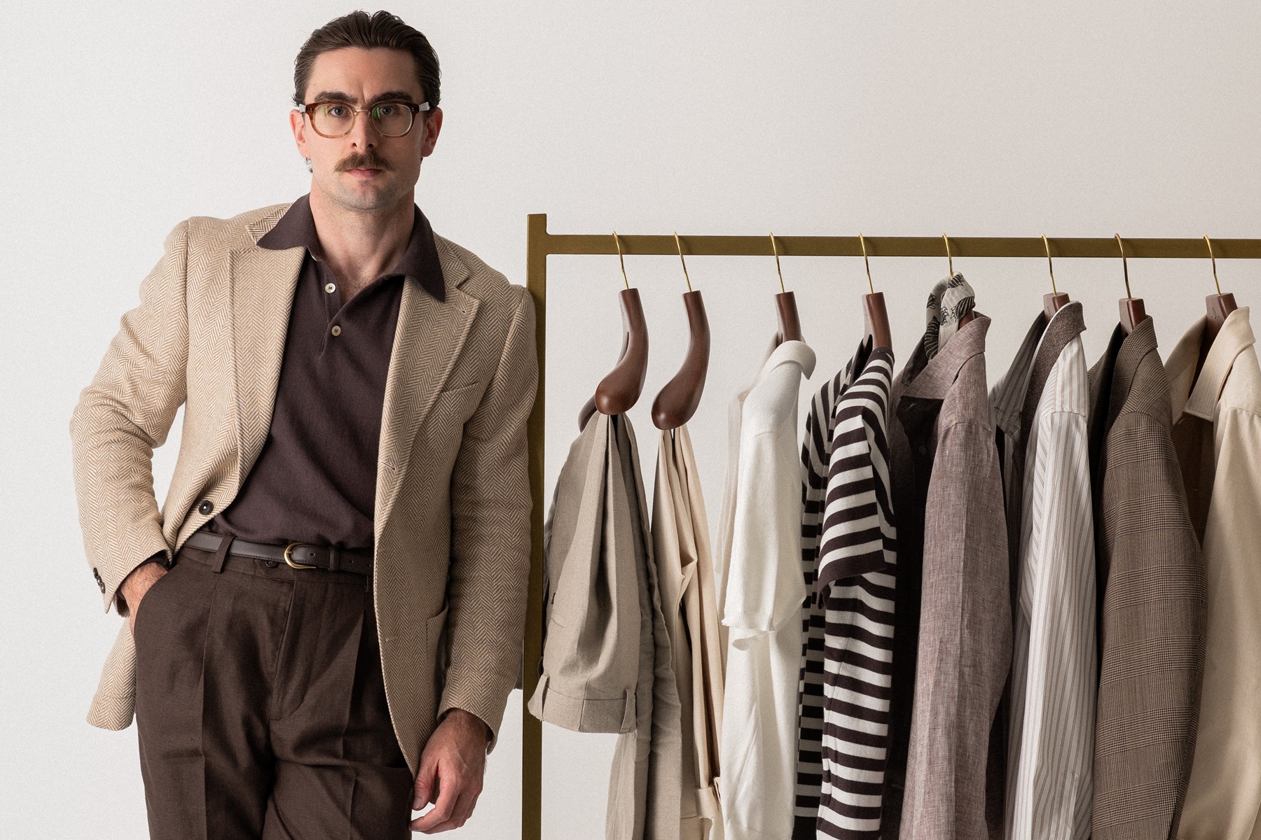
My favorite combination for casual dressing is light trousers, a mid-shade shirt, and a dark jacket. But when it comes to tailoring, all options can look great because it really depends on the individual piece I want to highlight, and then I build the rest of the outfit around it. For example, I think a dark brown polo really highlights a beige herringbone sport coat, even when it's paired with light trousers. But if you really want the sport coat to stand out, swap the light trousers for brown ones in a shade similar to the polo, so you have a dark base and the jacket stands out even more.
This spring-summer collection includes a variety of neutral pieces that work really well together, which I believe is shown really well with this capsule collection, as you can really play with contrast and create basically all the combinations that I mentioned above.
If you enjoyed the tonal capsule theme, be sure to read Suzan’s post where he describes the wardrobe he built using 11 pieces from our collection – available on his website at the following link: "Spring-Summer Tonal Capsule Wardrobe with Poszetka"